Map Image#
The geetools extension contains a set of functions for rendering maps from ee.Image objects. Use the following function descriptions and examples to determine the best function and chart type for your purpose.
Set up environment#
Install the required packages and authenticate your Earth Engine account.
# uncomment if installation of libs is necessary
# !pip install earthengine-api geetools
from IPython.display import display
from matplotlib import pyplot as plt

import ee
import geetools #noqa: F401
# uncomment if authetication to GEE is needed
# ee.Authenticate()
# ee.Intialize(project="<your_project>")
Example data#
The following examples rely on the “COPERNICUS/S2_HARMONIZED” ee.ImageCollection filtered between 2022-06-01 and 2022-06-30. We then build the NDVI spectral indice and use mosaic to get an ee.Image object. This object is clipped over the Vatican city as it’s one of the smallest country in the world.
# load the vatican
level0 = ee.FeatureCollection("FAO/GAUL/2015/level0")
vatican = level0.filter(ee.Filter.eq("ADM0_NAME", "Holy See"))

# pre-process the imagecollection and mosaic the month of June 2022
image = (
    ee.ImageCollection('COPERNICUS/S2_HARMONIZED')
    .filterDate('2022-06-01', '2022-06-30')
    .filterBounds(vatican)
    .geetools.maskClouds()
    .geetools.spectralIndices("NDVI")
    .mosaic()
)
/home/docs/checkouts/readthedocs.org/user_builds/geetools/envs/v1.18.1/lib/python3.10/site-packages/ee_extra/QA/clouds.py:344: UserWarning: This platform is not supported for cloud masking.
  warnings.warn("This platform is not supported for cloud masking.")
Map Raster#
See API
plot:
geetools.ImageAccessor.plot not found
An ee.image is a raster representation of the Earth’s surface. The plot function allows you to visualize the raster data on a map. The function provides options to customize the visualization, such as the color palette, opacity, and the visualization range.
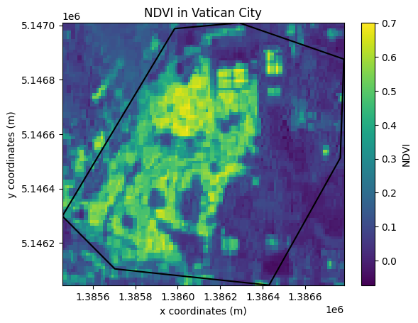
Map pseudo color#
A pseudo-color image is a single-band raster image that uses a color palette to represent the data. The following example demonstrates how to plot the NDVI pseudo-color image using the plot function.
First create a matplotlib figure and axis. Then you can add the map to the axis. Provide a single element list in the bands parameter to plot the NDVI image.
As per interactive representation an image needs to be reduced to a region, here “Vatican City”. In this example we also select a pseudo-mercator projection and we displayed the ee.FeatureCollection on top of it. Now that we have the plot, we can customize it with matplotlib. For example, we can add a title and a colorbar. Now that we have the plot, we can customize it with matplotlib. For example, we can add a title and a colorbar.
fig, ax = plt.subplots()

image.geetools.plot(
    bands = ["NDVI"],
    ax=ax,
    region=vatican.geometry(),
    crs="EPSG:3857",
    scale=10,
    fc=vatican,
    cmap="viridis",
    color="k"
)

# as it's a figure you can then edit the information as you see fit
ax.set_title("NDVI in Vatican City")
ax.set_xlabel("x coordinates (m)")
ax.set_ylabel("y coordinates (m)")
fig.colorbar(ax.images[0], label="NDVI")

plt.show()
/home/docs/checkouts/readthedocs.org/user_builds/geetools/envs/v1.18.1/lib/python3.10/site-packages/xee/ext.py:696: UserWarning: Unable to retrieve 'system:time_start' values from an ImageCollection due to: No 'system:time_start' values found in the 'ImageCollection'.
  warnings.warn(
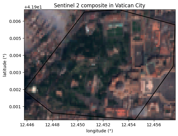
Map RGB combo#
An RGB image is a three-band raster image that uses the red, green, and blue bands to represent the data. The following example demonstrates how to plot the RGB image using the plot function.
First create a matplotlib figure and axis. Then you can add the map to the axis. Provide a 3 elements list in the bands parameter to plot the NDVI image.
As per interactive representation an image needs to be reduced to a region, here “Vatican City”. In this example we displayed the ee.FeatureCollection on top of it. Finally customize the plot.
# Create the plot figure
fig, ax = plt.subplots()

# Create the graph
image.geetools.plot(
    bands = ["B4", "B3", "B2"],
    ax=ax,
    region=vatican.geometry(),
    fc=vatican,
    color="k"
)

# as it's a figure you can then edit the information as you see fit
ax.set_title("Sentinel 2 composite in Vatican City")
ax.set_xlabel("longitude (°)")
ax.set_ylabel("latitude (°)")

plt.show()
/home/docs/checkouts/readthedocs.org/user_builds/geetools/envs/v1.18.1/lib/python3.10/site-packages/xee/ext.py:696: UserWarning: Unable to retrieve 'system:time_start' values from an ImageCollection due to: No 'system:time_start' values found in the 'ImageCollection'.
  warnings.warn(