Plot FeatureCollection#
The geetools extension contains a set of functions for rendering charts from ee.FeatureCollection objects. The choice of function determines the arrangement of data in the chart, i.e., what defines x- and y-axis values and what defines the series. Use the following function descriptions and examples to determine the best function and chart type for your purpose.
Set up environment#
Install all the required libs if necessary and perform the import statements upstream.
# uncomment if installation of libs is necessary
# !pip install earthengine-api geetools
from matplotlib import pyplot as plt

import ee
import geetools #noqa: F401
# uncomment if authetication to GEE is needed
# ee.Authenticate()
# ee.Intialize(project="<your_project>")
Example data#
The following examples rely on a FeatureCollection composed of three ecoregion features with properties that describe climate normals.
# Import the example feature collection.
ecoregions = ee.FeatureCollection('projects/google/charts_feature_example')
Plot by features#
Features are plotted along the x-axis by values of a selected property. Series are defined by a list of property names whose values are plotted along the y-axis. The type of produced chart can be controlled by the type parameter as shown in the following examples.
If you want to use another plotting library you can get the raw data using the byFeatures function.
See API
geetools.FeatureCollectionAccessor.plot_by_features not found
byFeatures: Get a dictionary with all property values for each feature.
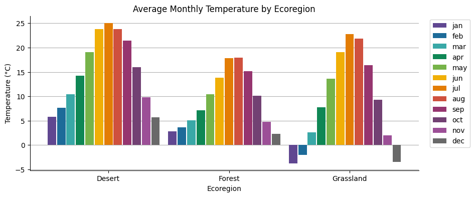
Column chart#
Features are plotted along the x-axis, labeled by values of a selected property. Series are represented by adjacent columns defined by a list of property names whose values are plotted along the y-axis.
fig, ax = plt.subplots(figsize=(10, 4))

# initialize the plot with the ecoregions data
ecoregions.geetools.plot_by_features(
    type = "bar",
    featureId = "label",
    properties = ['01_tmean', '02_tmean', '03_tmean', '04_tmean', '05_tmean', '06_tmean', '07_tmean', '08_tmean', '09_tmean', '10_tmean', '11_tmean', '12_tmean'],
    labels = ["jan", "feb", "mar", "apr", "may", "jun", "jul", "aug", "sep", "oct", "nov", "dec"],
    colors = ['#604791', '#1d6b99', '#39a8a7', '#0f8755', '#76b349', '#f0af07', '#e37d05', '#cf513e', '#96356f', '#724173', '#9c4f97', '#696969'],
    ax = ax
)

# once created the axes can be modified as needed using pure matplotlib functions
ax.set_title("Average Monthly Temperature by Ecoregion")
ax.set_xlabel("Ecoregion")
ax.set_ylabel("Temperature (°C)")
plt.show()
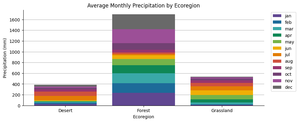
Stacked column chart#
Features are plotted along the x-axis, labeled by values of a selected property. Series are represented by stacked columns defined by a list of property names whose values are plotted along the y-axis as the cumulative series sum.
fig, ax = plt.subplots(figsize=(10, 4))

# initialize theplot with the ecoregions data
ecoregions.geetools.plot_by_features(
    type = "stacked",
    featureId = "label",
    properties = ['01_ppt', '02_ppt', '03_ppt', '04_ppt', '05_ppt', '06_ppt', '07_ppt', '08_ppt', '09_ppt', '10_ppt', '11_ppt', '12_ppt'],
    labels = ["jan", "feb", "mar", "apr", "may", "jun", "jul", "aug", "sep", "oct", "nov", "dec"],
    colors = ['#604791', '#1d6b99', '#39a8a7', '#0f8755', '#76b349', '#f0af07', '#e37d05', '#cf513e', '#96356f', '#724173', '#9c4f97', '#696969'],
    ax = ax
)

# once created the axes can be modified as needed using pure matplotlib functions
ax.set_title("Average Monthly Precipitation by Ecoregion")
ax.set_xlabel("Ecoregion")
ax.set_ylabel("Precipitation (mm)")
plt.show()
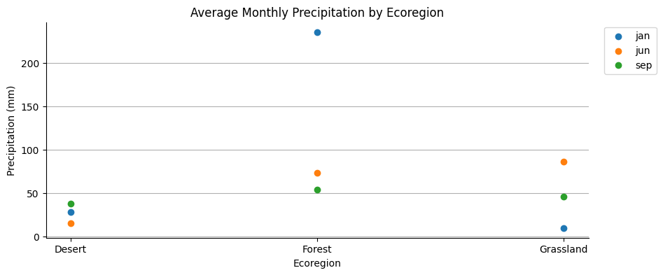
Scatter chart#
Features are plotted along the x-axis, labeled by values of a selected property. Series are represented by points defined by a list of property names whose values are plotted along the y-axis.
fig, ax = plt.subplots(figsize=(10, 4))

# initialize theplot with the ecoregions data
ecoregions.geetools.plot_by_features(
    type = "scatter",
    featureId = "label",
    properties = ['01_ppt', '06_ppt', '09_ppt'],
    labels = ["jan", "jun", "sep"],
    ax = ax
)

# once created the axes can be modified as needed using pure matplotlib functions
ax.set_title("Average Monthly Precipitation by Ecoregion")
ax.set_xlabel("Ecoregion")
ax.set_ylabel("Precipitation (mm)")
plt.show()
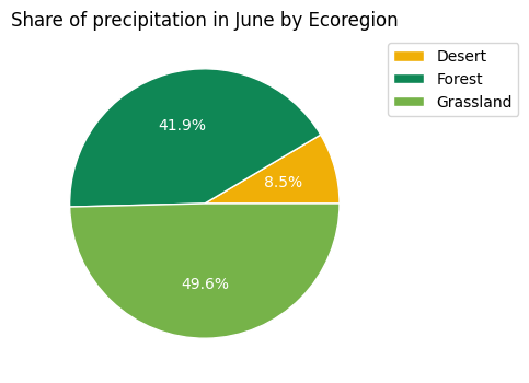
Pie chart#
The pie is a property, each slice is the share from each feature whose value is cast as a percentage of the sum of all values of features composing the pie.
fig, ax = plt.subplots(figsize=(10, 4))

# initialize theplot with the ecoregions data
ecoregions.geetools.plot_by_features(
    type = "pie",
    featureId = "label",
    properties = ['06_ppt'],
    colors = ["#f0af07", "#0f8755", "#76b349"],
    ax = ax
)

# once created the axes can be modified as needed using pure matplotlib functions
ax.set_title("Share of precipitation in June by Ecoregion")
plt.show()
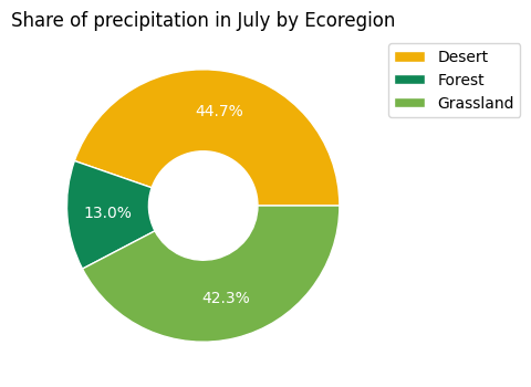
Donut chart#
The donut is a property, each slice is the share from each feature whose value is cast as a percentage of the sum of all values of features composing the donut.
fig, ax = plt.subplots(figsize=(10, 4))

# initialize theplot with the ecoregions data
ecoregions.geetools.plot_by_features(
    type = "donut",
    featureId = "label",
    properties = ['07_ppt'],
    colors = ["#f0af07", "#0f8755", "#76b349"],
    ax = ax
)

# once created the axes can be modified as needed using pure matplotlib functions
ax.set_title("Share of precipitation in July by Ecoregion")
plt.show()
Plot by properties#
Feature properties are plotted along the x-axis by name; values of the given properties are plotted along the y-axis. Series are features labeled by values of a selected property. The type of produced chart can be controlled by the type parameter as shown in the following examples.
See API
plot_by_properties: Plot the values of a :py:class:`ee.FeatureCollection` by property.byProperties: Get a dictionary with all feature values for each property.
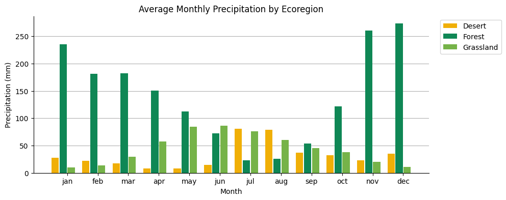
Column chart#
Feature properties are plotted along the x-axis, labeled and sorted by a dictionary input; the values of the given properties are plotted along the y-axis. Series are features, represented by columns, labeled by values of a selected property.
fig, ax = plt.subplots(figsize=(10, 4))


# initialize theplot with the ecoregions data
ax = ecoregions.geetools.plot_by_properties(
    type = "bar",
    properties = ['01_ppt', '02_ppt', '03_ppt', '04_ppt', '05_ppt', '06_ppt', '07_ppt', '08_ppt', '09_ppt', '10_ppt', '11_ppt', '12_ppt'],
    labels = ["jan", "feb", "mar", "apr", "may", "jun", "jul", "aug", "sep", "oct", "nov", "dec"],
    featureId = "label",
    colors = ["#f0af07", "#0f8755", "#76b349"],
    ax = ax
)

# once created the axes can be modified as needed using pure matplotlib functions
ax.set_title("Average Monthly Precipitation by Ecoregion")
ax.set_xlabel("Month")
ax.set_ylabel("Precipitation (mm)")
plt.show()
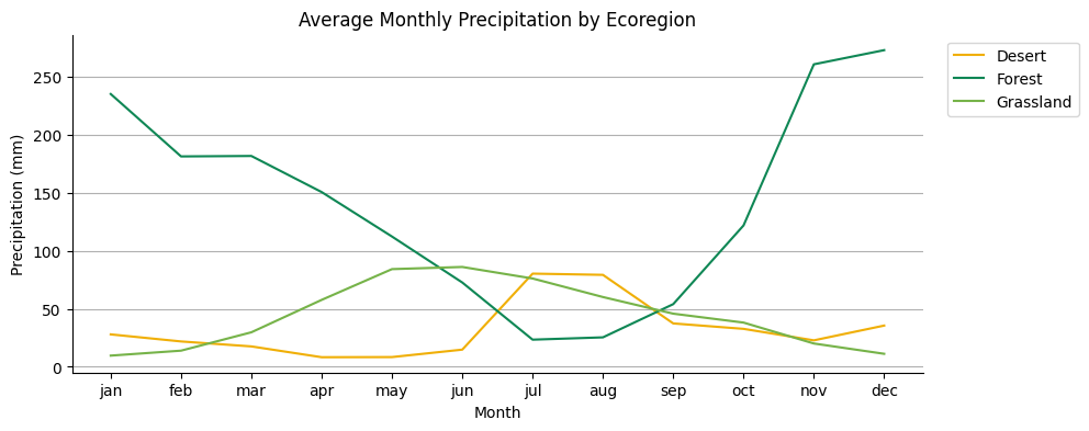
Line chart#
Feature properties are plotted along the x-axis, labeled and sorted by a dictionary input; the values of the given properties are plotted along the y-axis. Series are features, represented by columns, labeled by values of a selected property.
fig, ax = plt.subplots(figsize=(10, 4))

# initialize theplot with the ecoregions data
ax = ecoregions.geetools.plot_by_properties(
    type = "plot",
    properties = ["01_ppt", "02_ppt", "03_ppt", "04_ppt", "05_ppt", "06_ppt", "07_ppt", "08_ppt", "09_ppt", "10_ppt", "11_ppt", "12_ppt"],
    featureId = "label",
    labels = ["jan", "feb", "mar", "apr", "may", "jun", "jul", "aug", "sep", "oct", "nov", "dec"],
    colors = ["#f0af07", "#0f8755", "#76b349"],
    ax = ax
)

# once created the axes can be modified as needed using pure matplotlib functions
ax.set_title("Average Monthly Precipitation by Ecoregion")
ax.set_xlabel("Month")
ax.set_ylabel("Precipitation (mm)")
plt.show()
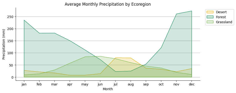
Area chart#
Feature properties are plotted along the x-axis, labeled and sorted by a dictionary input; the values of the given properties are plotted along the y-axis. Series are features, represented by lines and shaded areas, labeled by values of a selected property.
fig, ax = plt.subplots(figsize=(10, 4))

# initialize the plot with the ecoregions data
ax = ecoregions.geetools.plot_by_properties(
    type = "fill_between",
    properties = ["01_ppt", "02_ppt", "03_ppt", "04_ppt", "05_ppt", "06_ppt", "07_ppt", "08_ppt", "09_ppt", "10_ppt", "11_ppt", "12_ppt"],
    labels = ["jan", "feb", "mar", "apr", "may", "jun", "jul", "aug", "sep", "oct", "nov", "dec"],
    featureId = "label",
    colors = ["#f0af07", "#0f8755", "#76b349"],
    ax = ax
)

# once created the axes can be modified as needed using pure matplotlib functions
ax.set_title("Average Monthly Precipitation by Ecoregion")
ax.set_xlabel("Month")
ax.set_ylabel("Precipitation (mm)")
plt.show()
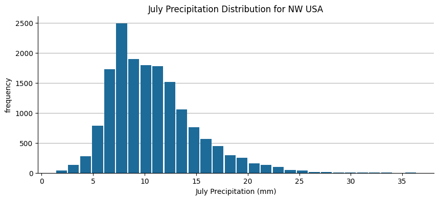
Plot hist#
See API
plot_hist: Plot the histogram of a specific property.
The x-axis is defined by value bins for the range of values of a selected property; the y-axis is the number of elements in the given bin.
fig, ax = plt.subplots(figsize=(10, 4))

# load some data
normClim = ee.ImageCollection('OREGONSTATE/PRISM/Norm91m').toBands()

# Make a point sample of climate variables for a region in western USA.
region = ee.Geometry.Rectangle(-123.41, 40.43, -116.38, 45.14)
climSamp = normClim.sample(region, 5000)


# initialize the plot with the ecoregions data
ax = climSamp.geetools.plot_hist(
    property = "07_ppt",
    label = "July Precipitation (mm)",
    color = '#1d6b99',
    ax = ax,
    bins = 30
)

# once created the axes can be modified as needed using pure matplotlib functions
ax.set_title("July Precipitation Distribution for NW USA")
plt.show()