Plotting#
We embed some plotting capabilities in the library to help you visualize your data. For simplicity we decided to map all the plotting function to the matplotlib library as it’s the most used static plotting library in the Python ecosystem.
FeatureCollection
Image
ImageCollection
Image
FeatureCollection
In all these examples we will use the object interface of matplotlib creating the Figure and Axes object before plotting the data. This is the recommended way to use matplotlib as it gives you more control over the plot and the figure.
# custom image for this specific chart
modisSr = (
   ee.ImageCollection("MODIS/061/MOD09A1")
   .filter(ee.Filter.date("2018-06-01", "2018-09-01"))
   .select(["sur_refl_b01", "sur_refl_b02", "sur_refl_b06"])
   .mean()
)
histRegion = ee.Geometry.Rectangle([-112.60, 40.60, -111.18, 41.22])

#create a matplotlib figure
fig, ax = plt.subplots(figsize=(10, 4))

# plot the histogram of the reds
modisSr.geetools.plot_hist(
   bands = ["sur_refl_b01", "sur_refl_b02", "sur_refl_b06"],
   labels = [['Red', 'NIR', 'SWIR']],
   colors = ["#cf513e", "#1d6b99", "#f0af07"],
   ax = ax,
   bins = 100,
   scale = 500,
   region = histRegion,
)

# once created the axes can be modified as needed using pure matplotlib functions
ax.set_title("Modis SR Reflectance Histogram")
ax.set_xlabel("Reflectance (x1e4)")

If you are used to the pyplot interface of matplotlib you can still use it with the state-base module of matplotlib. Just be aware that the module is a stateful interface and you will have less control over the figure and the plot.
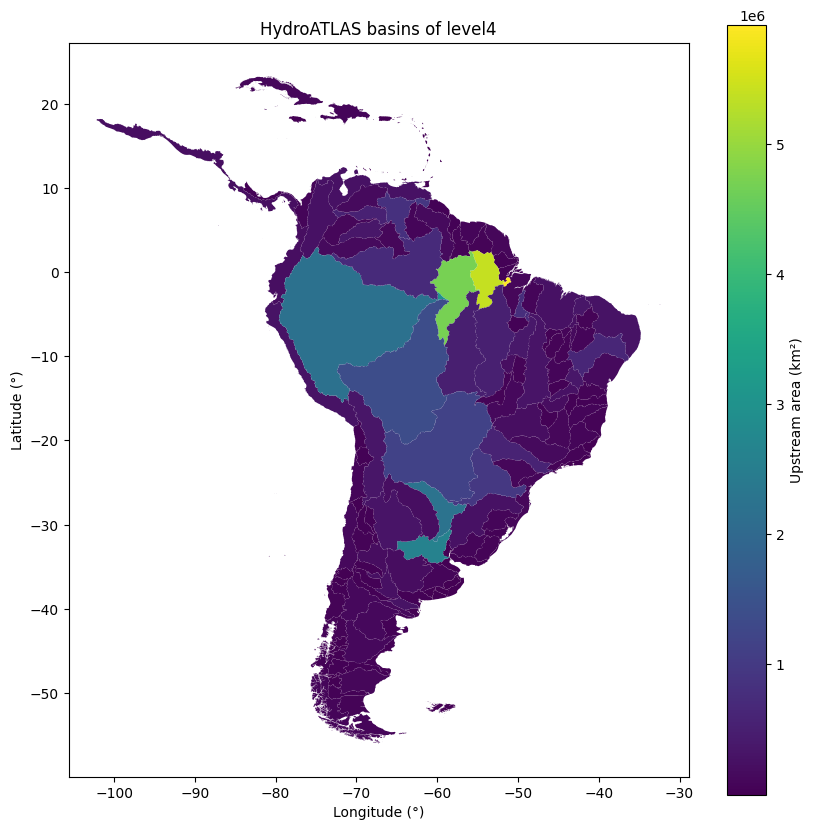
# get all hydroshed from the the south amercias within the WWF/HydroATLAS dataset.
region = ee.Geometry.BBox(-80, -60, -20, 20);
fc = ee.FeatureCollection('WWF/HydroATLAS/v1/Basins/level04').filterBounds(region)

# create the plot
fc.geetools.plot(property="UP_AREA", cmap="viridis")

# Customized display
plt.colorbar(ax.collections[0], label="Upstream area (km²)")
plt.title("HydroATLAS basins of level4")
plt.xlabel("Longitude (°)")
plt.ylabel("Latitude (°)")